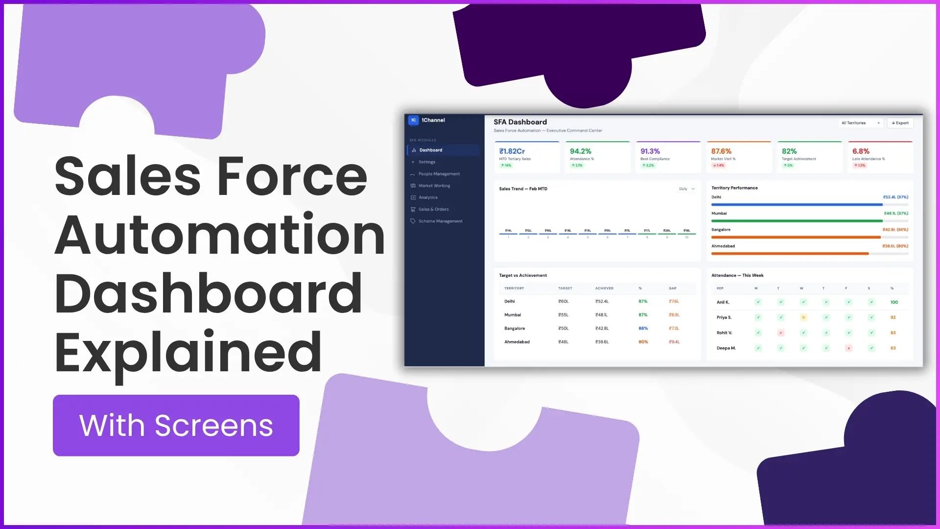
A Sales Force Automation (SFA) dashboard is the command centre for field sales operations. It gives managers, regional heads, and business teams a real-time view of sales performance, attendance, market visits, territory progress, and workforce productivity all from one screen.
The dashboard is typically the first screen visible in the admin portal, designed to convert field activity into actionable insights. As per the provided portal documentation, dashboard widgets and reports are configurable based on business requirements, making it highly flexible for different industries and sales structures.
In this blog, we explain what each dashboard screen means and how it helps sales leaders make faster decisions.
Why an SFA Dashboard Matters?
Managing a field sales team without visibility leads to delayed decisions, poor beat compliance, and missed targets.
An SFA dashboard solves this by helping managers track:
- Sales performance in real time
- Team attendance and late logins
- Market visit compliance
- Territory-wise achievement
- Target vs actual gap
- Exportable reports for deeper analysis
Instead of manually compiling data from multiple reports, everything is visible at a glance.
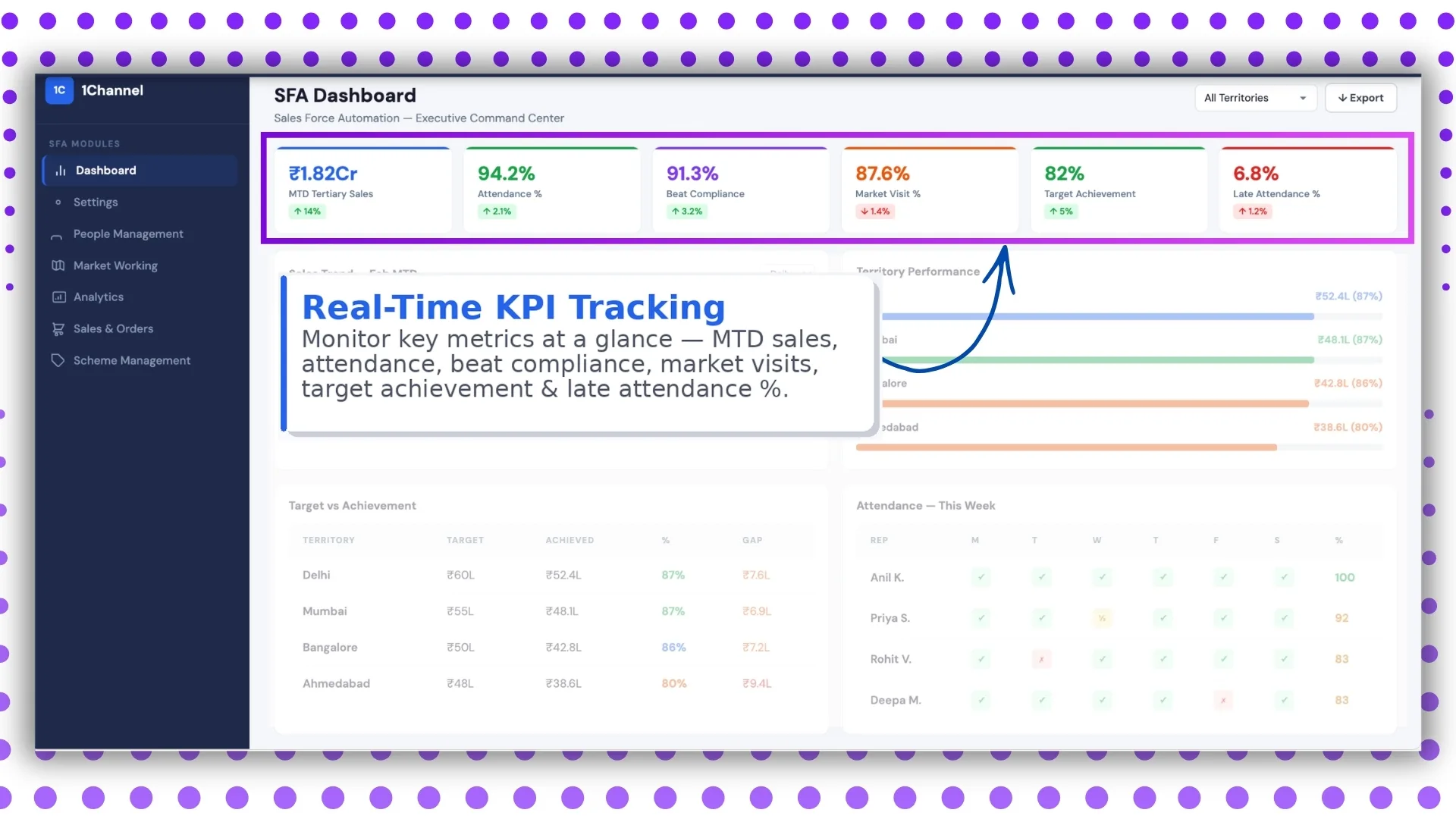
Screen 1: Real-Time KPI Tracking
The first dashboard screen focuses on live operational KPIs.
It includes:
- MTD sales
- Attendance %
- Beat compliance
- Market visits
- Target achievement
- Late attendance %
This aligns directly with the advanced dashboard structure shared in the document, where attendance reporting, present percentage, late attendance, and market visit percentages are shown in the default admin dashboard.
Why this screen is important
This screen acts as the daily control panel for managers.
In one view, leadership can instantly understand:
- How the month is progressing
- Whether field reps are following their routes
- Which KPIs need immediate intervention
For example, if late attendance spikes or beat compliance drops, action can be taken the same day.
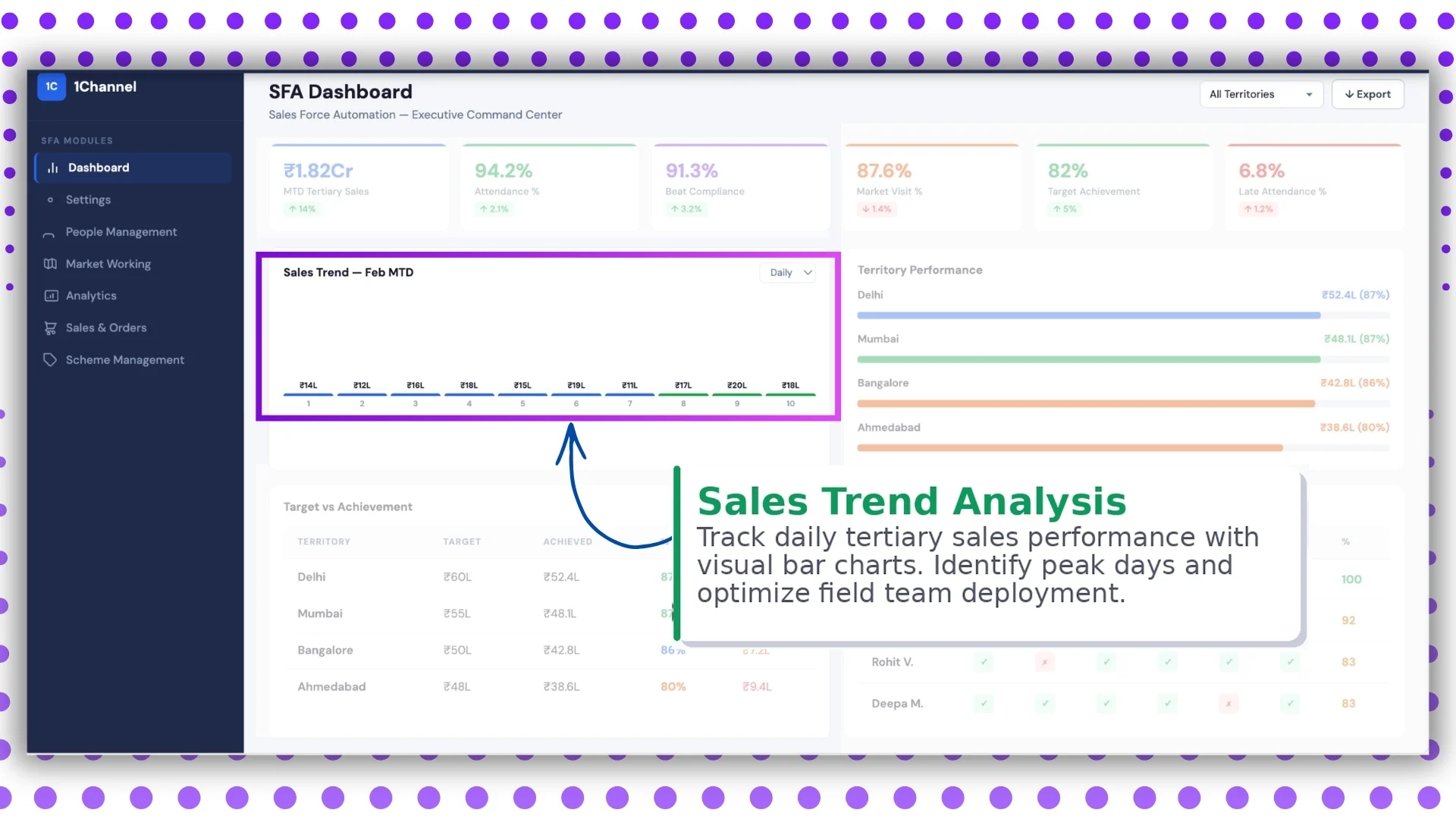
Screen 2: Sales Trend Analysis
The second screen visualizes daily tertiary sales trends using bar charts.
This helps teams identify:
- Peak sales days
- Slow-performing days
- Weekday sales patterns
- Seasonal demand trends
The platform's analytics module already supports multiple sales reports such as:
- MTD tertiary sales
- secondary sales
- sales by product category
- sales productivity reports
This screen converts those datasets into visual insights.
Business value
Managers can optimize field deployment based on actual performance.
For example:
- Assign more reps on high-conversion days
- Increase store visits before low-sales periods
- adjust territory priorities
This improves productivity without increasing headcount.
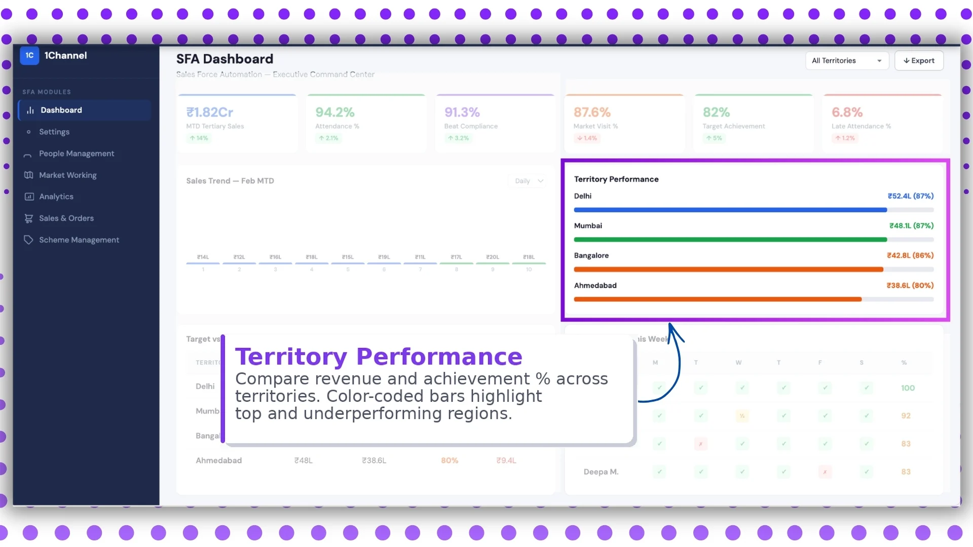
Screen 3: Territory Performance Dashboard
This screen compares performance across territories using color-coded revenue and achievement bars.
Typically, it highlights:
- Territory revenue
- Achievement %
- Top-performing regions
- Underperforming territories
The documentation also confirms territory-level configurations and store-region hierarchy support inside store management and territory settings.
Why this matters
Sales heads can immediately identify:
- Which region is exceeding targets
- Which location needs support
- Where sales resources should be reallocated
The visual colour coding makes decision-making faster than reading spreadsheets.
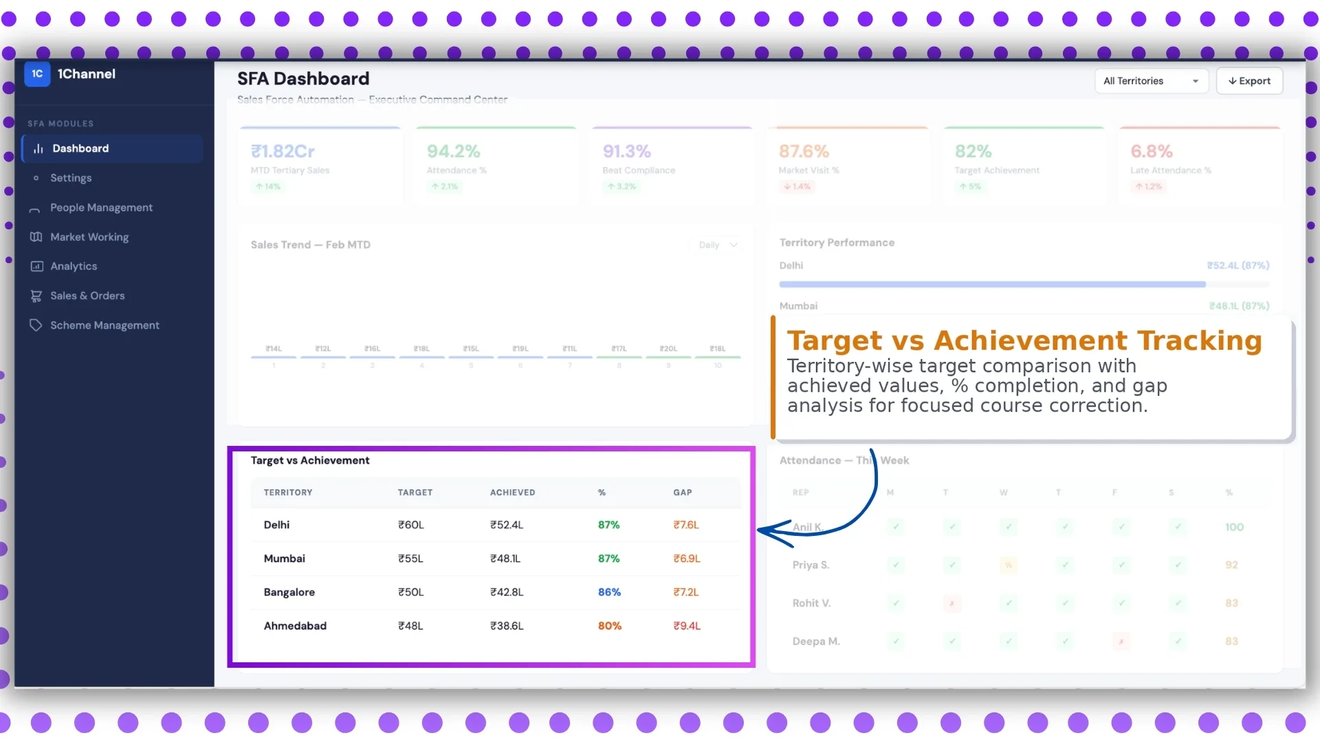
Screen 4: Target vs Achievement Tracking
This is one of the most important screens for sales leadership.
It shows:
- territory-wise targets
- achieved sales values
- completion %
- remaining gap
The uploaded document also mentions that targets can be defined for users and employees from the sales module.
This screen helps managers answer one key question:
How far are we from our sales goal?
Use case
Suppose Territory A has achieved 82% while Territory B is at 54%.
Managers can immediately investigate:
- stock issues
- field activity gaps
- low store productivity
- attendance issues
This enables focused course correction.
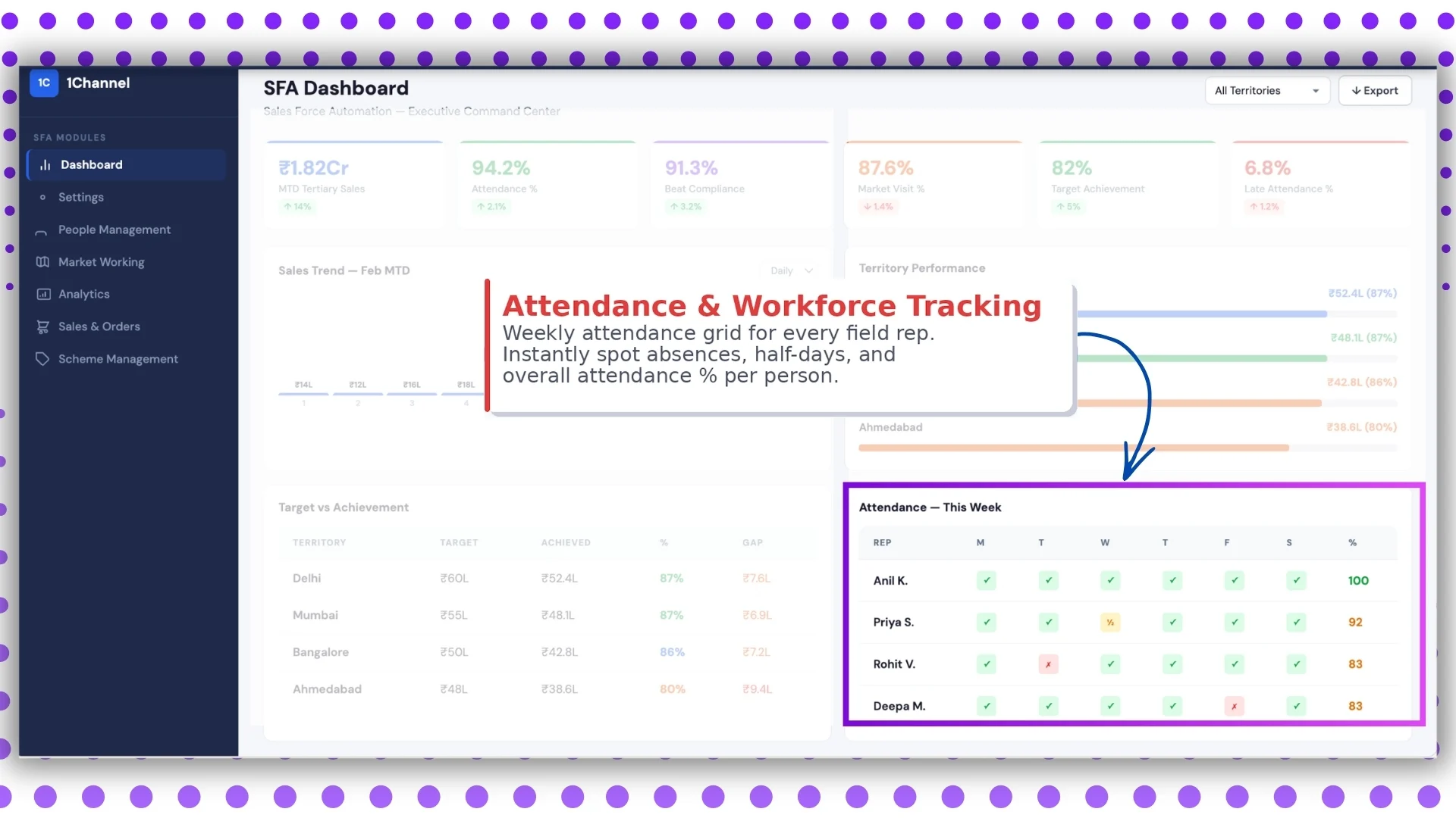
Screen 5: Attendance & Workforce Tracking
This screen is built for field team visibility.
It shows a weekly attendance grid for each field rep, including:
- present
- absent
- half day
- late mark
- attendance %
The platform's advanced dashboard and report catalog both include deep attendance tracking features.
These include:
- attendance summary
- detailed attendance reports
- attendance photo reports
- attendance & last transaction reports
Why it is useful
Managers can quickly spot:
- frequent absentees
- attendance defaulters
- underperforming reps
- payroll-impacting issues
This screen is especially useful for daily workforce management and payroll coordination.
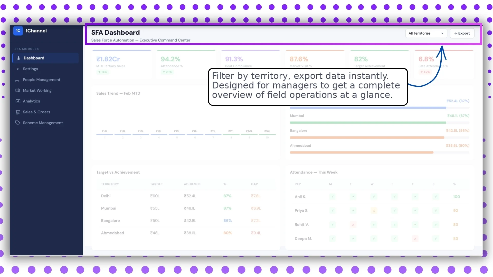
Screen 6: Territory Filters & Export Dashboard
The final screen is designed for operational flexibility.
It allows managers to:
- filter by territory
- filter by date range
- export data instantly
- review complete field operations
This aligns with the report catalogue and report builder functionality in the document, where users can apply dimensions, locations, date ranges, and download reports in Excel format.
Why this screen matters
Leadership teams often need reports for:
- review meetings
- regional audits
- monthly performance reviews
- management presentations
Export-ready dashboards reduce reporting effort significantly.
Note: Dashboard screens may vary based on your business structure and configured workflows.
Key Benefits of an SFA Dashboard
A well-designed dashboard helps businesses:
Faster decision-making
Live KPIs remove dependency on manual reporting.
Better territory control
Region-wise comparisons highlight performance gaps instantly.
Improved team productivity
Attendance and visit tracking ensure accountability.
Higher target achievement
Managers can intervene before targets are missed.
Stronger field visibility
Every activity from attendance to sales can be tracked centrally.
How the Dashboard Fits into the Larger SFA System
The dashboard is not a standalone screen.
It pulls data from multiple modules such as:
- analytics
- attendance
- market visit plans
- sales reports
- people management
- target settings
This creates a complete ecosystem for field force management.
Why 1Channel's SFA Dashboard Helps Sales Teams Move Faster?
If you are looking for a solution that gives complete visibility into your field operations, 1Channel's SFA dashboard helps managers track KPIs, sales trends, attendance, territory performance, and target achievement from one unified portal.
With customizable dashboards, export-ready reports, and role-based access controls, it is designed to support fast-moving field teams across multiple locations.
Whether you need workforce visibility, sales trend insights, or territory-wise reporting, the platform can be configured based on your operational needs.
Transform Field Sales with Real-Time Dashboards
1Channel Sales Force Automation provides comprehensive dashboard capabilities with real-time KPI tracking, sales trend analysis, territory performance monitoring, target vs achievement reports, attendance tracking, and export-ready analytics to help managers make faster data-driven decisions.
Explore Sales Force Automation →FAQs
What is a Sales Force Automation dashboard?
A Sales Force Automation dashboard is a centralized reporting screen that tracks sales KPIs, team attendance, market visits, and territory performance in real time.
Who uses the SFA dashboard?
It is mainly used by managers, sales heads, admins, and regional leaders for monitoring field operations.
Can the dashboard be customized?
Yes, as per the provided document, dashboard elements and menu sections can be customized based on business requirements.
Does it support territory-wise reporting?
Yes, territory comparison, target tracking, and region-wise filtering are supported.
Can reports be exported?
Yes, data can be exported instantly, and the report catalogue supports downloadable Excel reports.
Does it track employee attendance?
Yes, attendance percentage, late attendance, and detailed attendance reports are available.