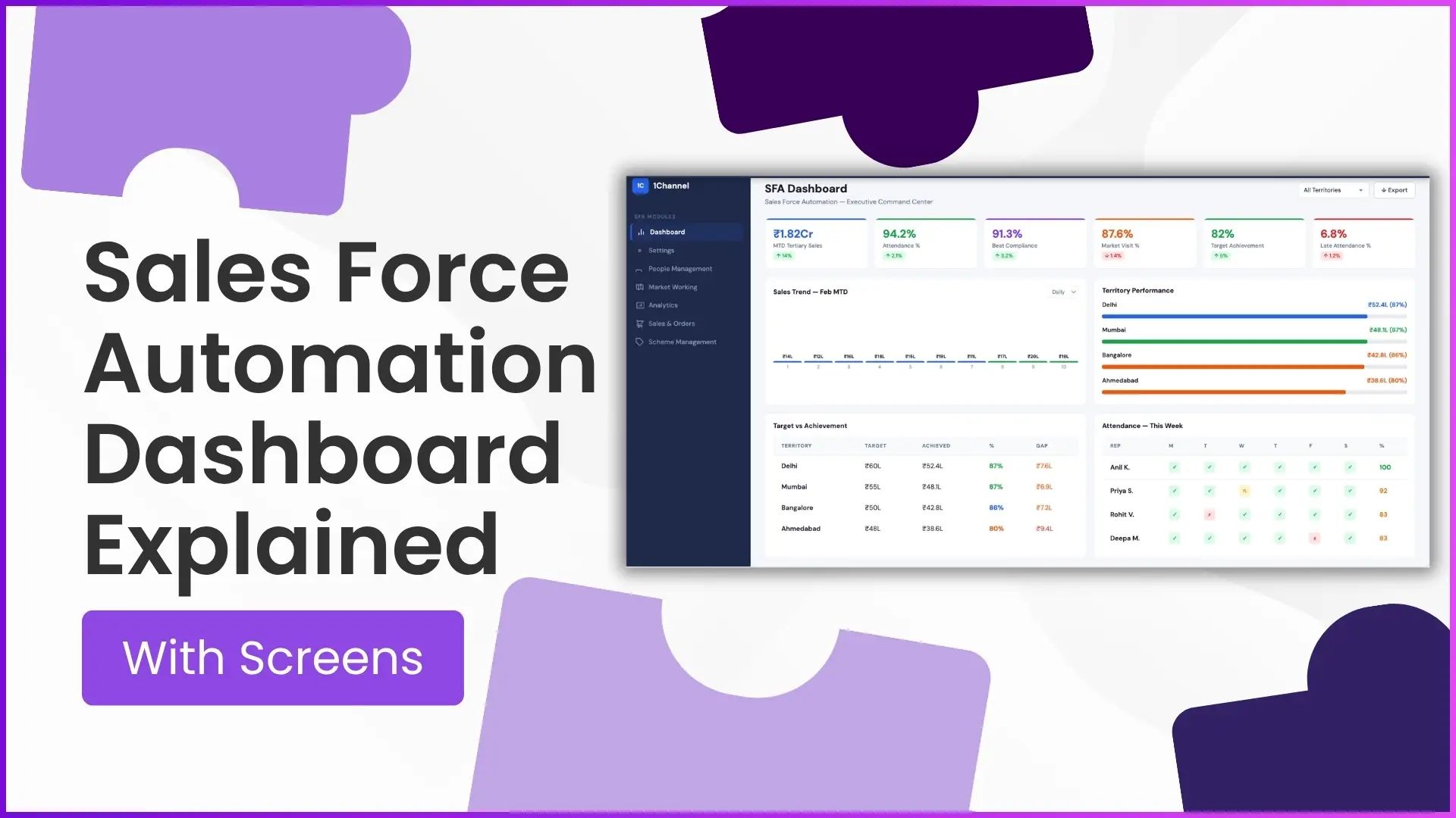
KPI status, sales trend, territory performance, target vs achievement, attendance, filterable export view. Six tiles, one dashboard, every signal a sales operation needs to read before the morning review.
Each tile answers a different question. None of them alone tells the full operational story, but together they replace the morning email chain and the spreadsheet pull.
Reading the dashboard well is a small operational skill that pays back fast. The screens below cover what each tile shows, what to look at first, and what patterns the well-built dashboard makes obvious.
Table of Contents
What an SFA Dashboard Actually Surfaces
An SFA dashboard is the consolidated read-out of every event the field has generated since the last refresh. Attendance, visits, orders, schemes, expenses, and exceptions all feed into one view.
The dashboard's job is to surface the patterns a human operator should care about. Targets met, partners slipping, regions accelerating, exceptions stacking up: each surfaces as a tile or a chart on the same screen.
Six Screens Worth Reading Every Cycle
Most SFA dashboards organise the data around six core screens. Each surfaces a different question.
Real-Time KPI Tracking
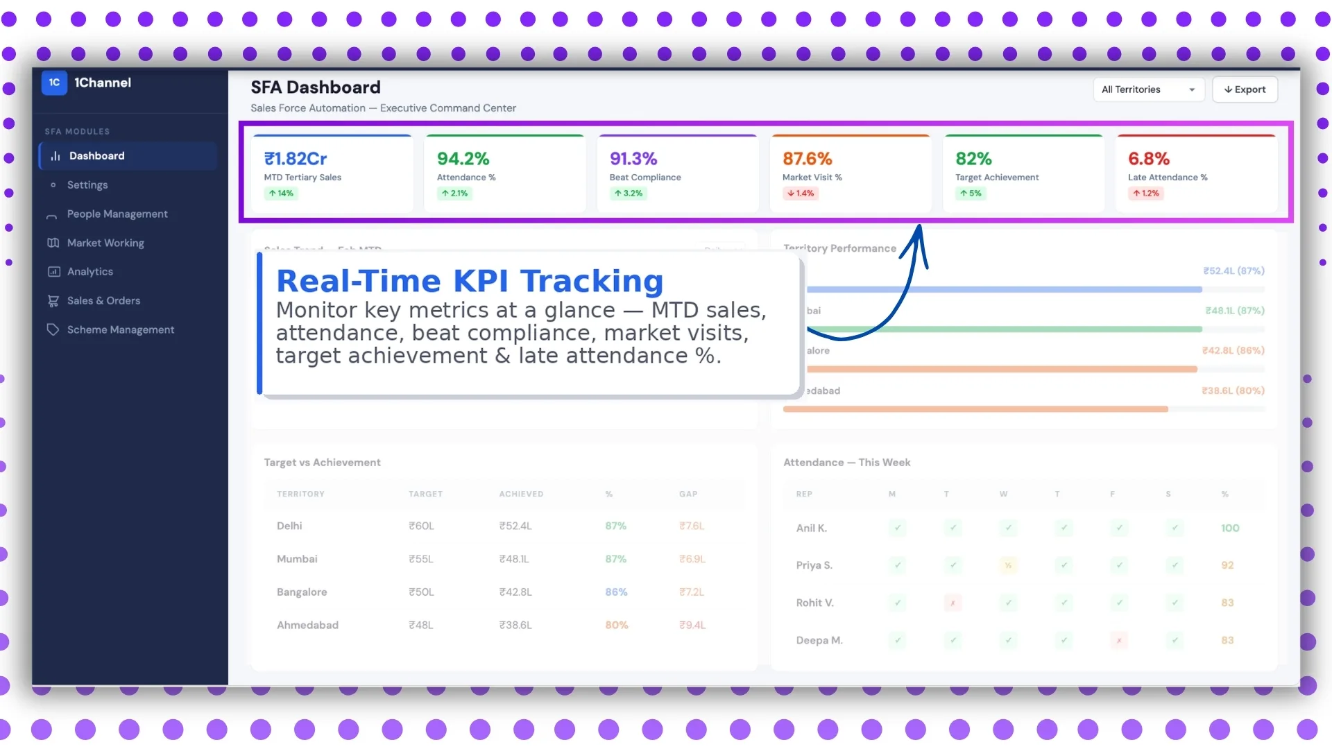
The top tile carries the daily KPI roll-up: visits done versus planned, orders booked versus target, attendance compliance, scheme execution. The numbers refresh as events land, so the manager reads yesterday's reality, not last week's summary.
Sales Trend Analysis
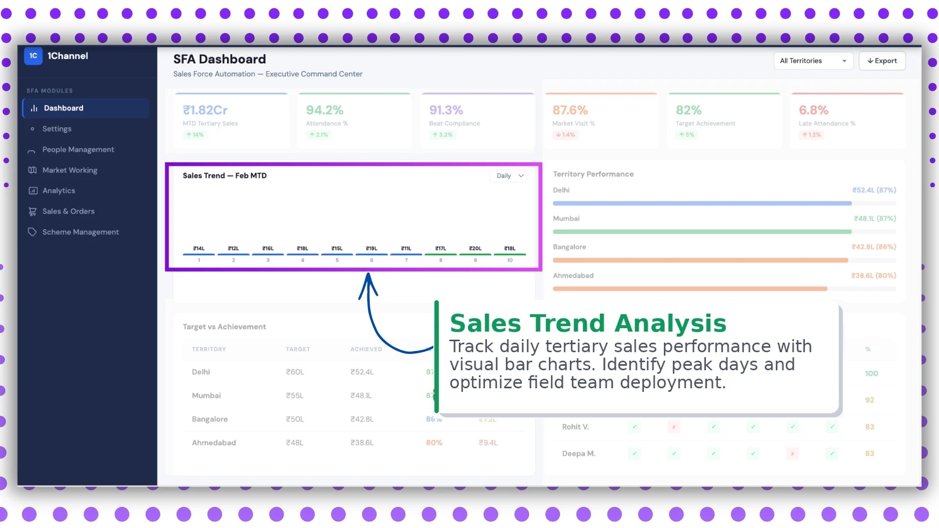
Trend lines show how each KPI is moving over the cycle. Weekly granularity catches drift early; monthly catches it after the damage is done. The dashboard should let the manager toggle between them in one click.
Territory Performance
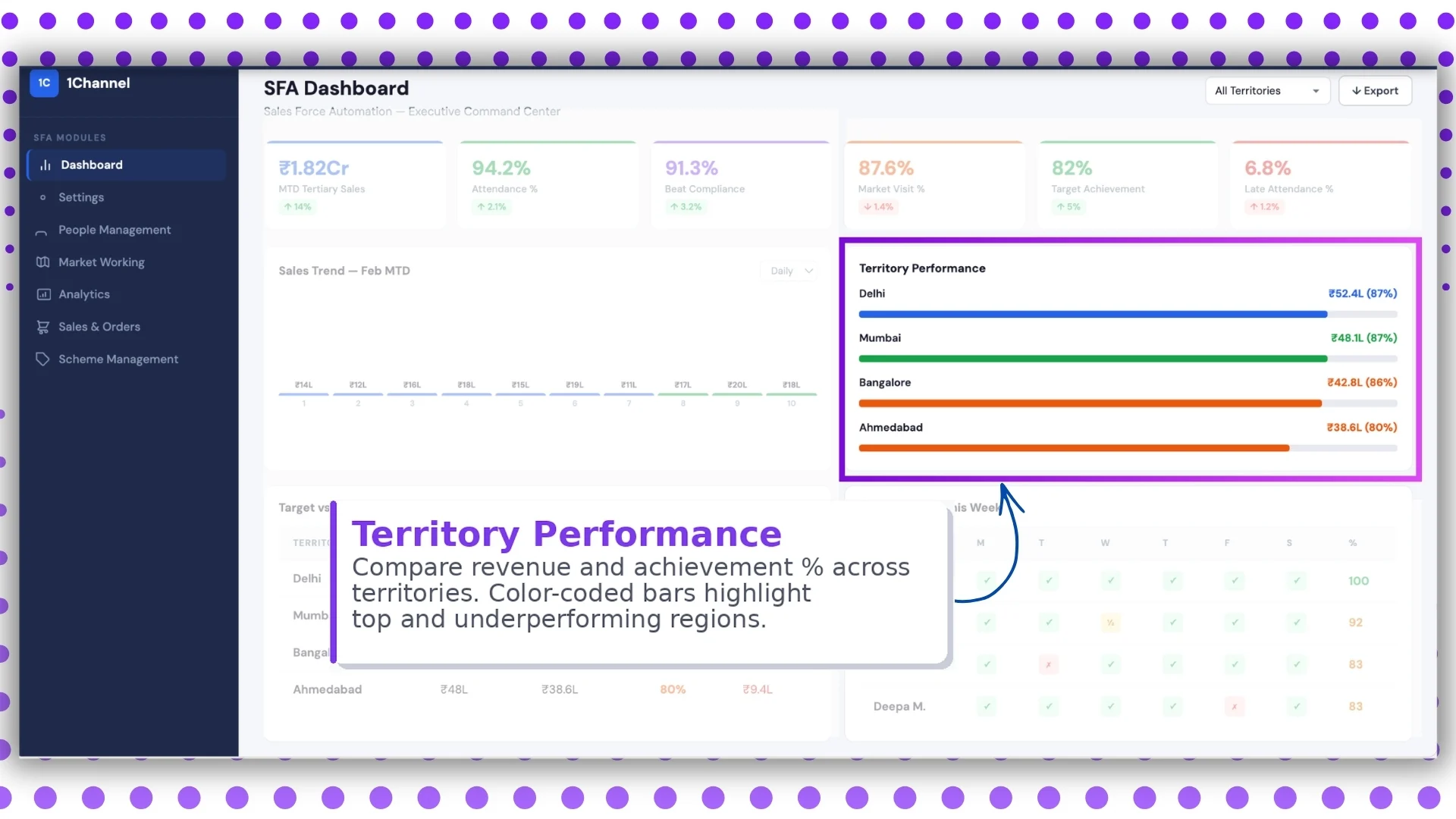
Each territory rolls up its KPIs side by side. The manager compares regions without exporting to a spreadsheet, and the laggards stand out without needing to be hunted down.
Target vs Achievement
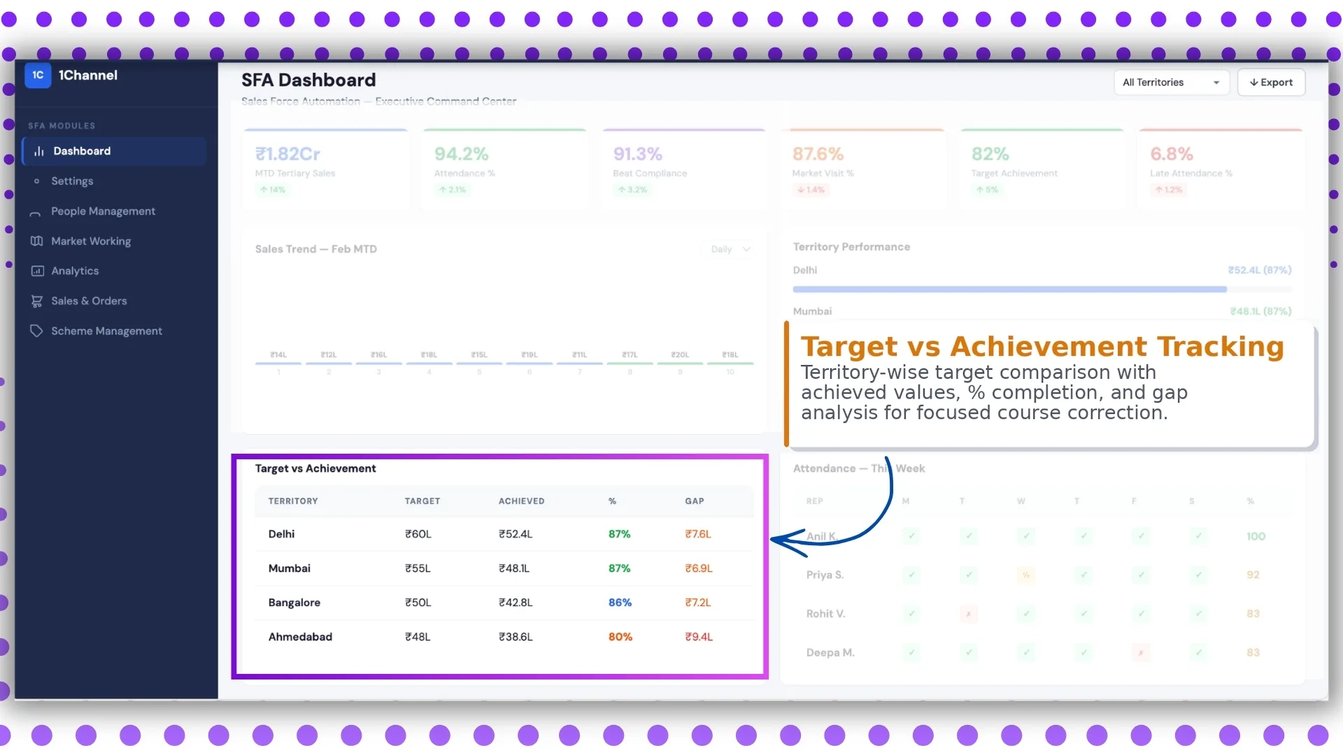
Every target the program runs gets a progress bar. Sales target, visit target, scheme adherence. Green for ahead of pace, amber for at-risk, red for off track. The colour code is what makes the screen scannable in 10 seconds.
Attendance and Workforce Tracking
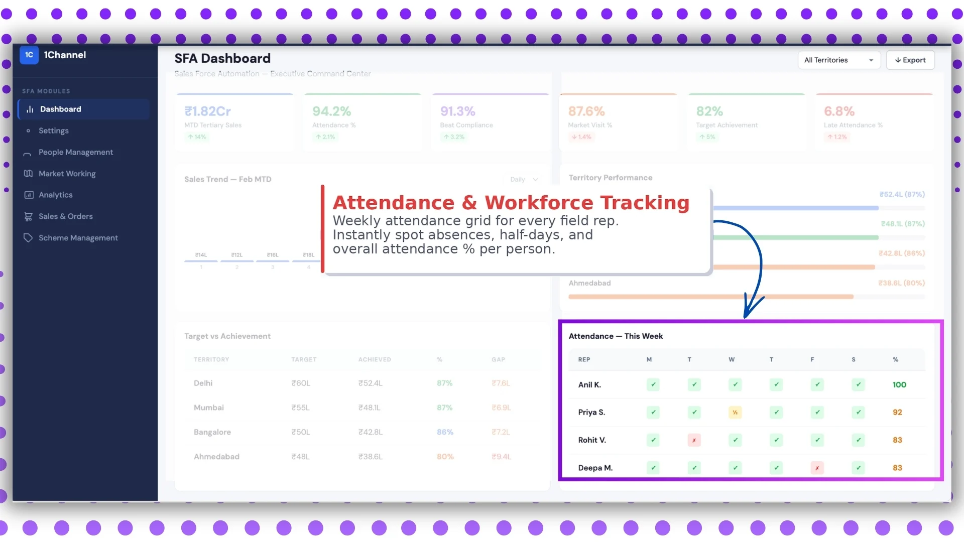
The workforce tile pairs attendance compliance with active-rep count and territory coverage. Holes show up immediately: a region with falling presence, a beat with no rep assigned, a team carrying too many off-days into quarter close.
Territory Filters and Export
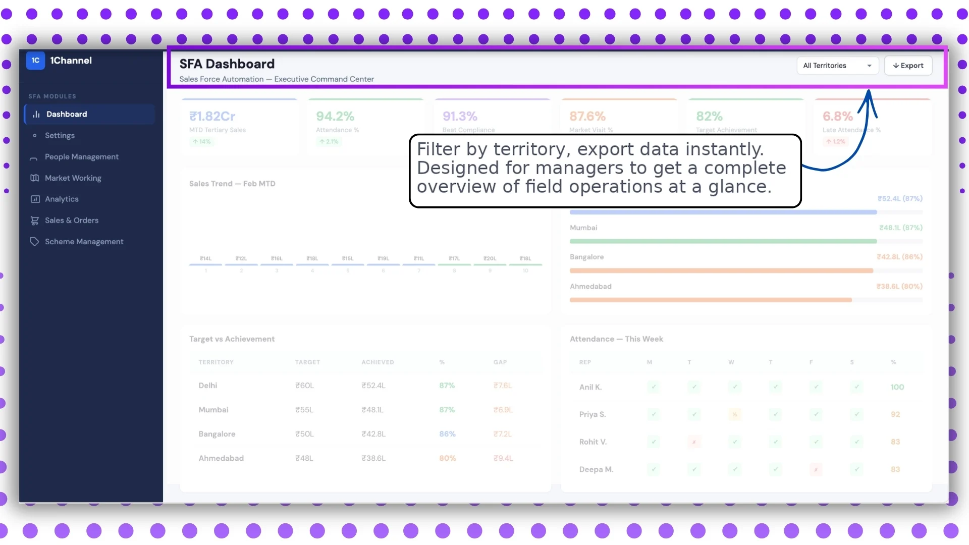
Filters narrow the view to a region, channel, tier, or partner segment. Export sends the same view to a CSV or PDF for the meeting that needs it as a hand-out. Both keep the dashboard usable across roles.
How the Dashboard Fits Into the Larger SFA Stack
The dashboard is downstream of every operational module. The mobile app captures, the cloud platform processes, the analytics layer aggregates, and the dashboard surfaces.
When the upstream chain is clean, the dashboard reads cleanly. When the chain has gaps like missing geofence, broken sync, or stale master data, the dashboard reads garbage. The platform that runs the whole chain on one ledger is what makes the dashboard trustworthy.
How 1Channel Runs SFA Dashboards for Malaysian Programs
1Channel runs SFA dashboards through its cloud Sales Force Automation and analytics modules. Every event from the field updates the dashboard automatically against the configured KPIs.
1Channel's AI engine watches for patterns the operator might miss. A KPI that is technically green but trending toward amber, a territory whose performance is concentrated in one rep, a target being met through one channel only: all surface as soft alerts.
Configuration runs through the admin console. New KPIs, filters, layouts, and export formats go live the same day they are approved, with an automated dry-run preview that validates the impact before activation.
Explore Cloud Sales Analytics Software
1Channel's cloud sales analytics platform powers SFA dashboards with AI signal detection and automated KPI rollups.
Explore Sales Analytics Software →Key Takeaways for Reading the Dashboard
Four points to carry into the next operations review:
- Read the screens in order. KPI, trend, territory, target, workforce, filtered view. The order builds the story from "what happened" to "what to do."
- Watch the colour codes, then the numbers. The dashboard's first job is to show what needs attention. Reading the numbers without scanning the codes first slows the meeting and buries the signal.
- Use filters before the meeting, not during it. Pre-built views save a 30-minute meeting from becoming a 50-minute one.
- Trust the upstream chain. A dashboard reads only as cleanly as the data feeding it. If the screens look wrong, the fix is usually upstream, not on the dashboard itself.